Quickshift: Redefining digital and web presence through cohesive visual storytelling.
Quickshift
Redefining digital and web presence through cohesive visual storytelling.
View Company Case Study
Freight
Description
Logistics and Supply Chain industry
Team project
We began the QuickShift project with in-depth stakeholder workshops and competitive analysis, to understand the unique challenges of logistics management like the complexity of varied users, multi-channel fulfillment and the need for clear, accessible information. Using a newly crafted timeless and tech-forward design system that embodied the company’s innovative ethos, we elevated their digital presence, positioning QuickShift as a formidable global supply chain competitor. By optimizing navigation and reinforcing hierarchical principles, we enabled users to seamlessly access essential features quickly and intuitively. The design approach was thoughtfully crafted to serve advanced logistics professionals and loyal customers, while also welcoming first-time users, thereby broadening QuickShift’s reach and making their offerings universally approachable.
Focus areas
Visual rebranding
Responsive web design
Visual storyboarding
Concept creation for motion graphics
Research
Insights that shaped the design language
The research phase was the foundation of our design language, beginning with stakeholder workshops and competitor analysis to understand QuickShift’s core values and industry challenges. We explored diverse options for the new brand identity, experimenting with color systems, typography, and structural layouts to align with the company’s values and stakeholder vision. By analyzing top supply chain management websites and identifying trending visual styles, we discovered that infographics and micro-animated visuals can significantly transform the storytelling experience. This approach ensured the website would appeal to a broader audience, simplifying complex logistics jargon into visually engaging content. As someone without a supply chain background, I leveraged this perspective to highlight how visual language could make services more intuitive and accessible, ultimately reshaping our design strategy to prioritize clarity, engagement, and inclusivity.
Key focus
From tech heavy navigation -> comprehensive experiences
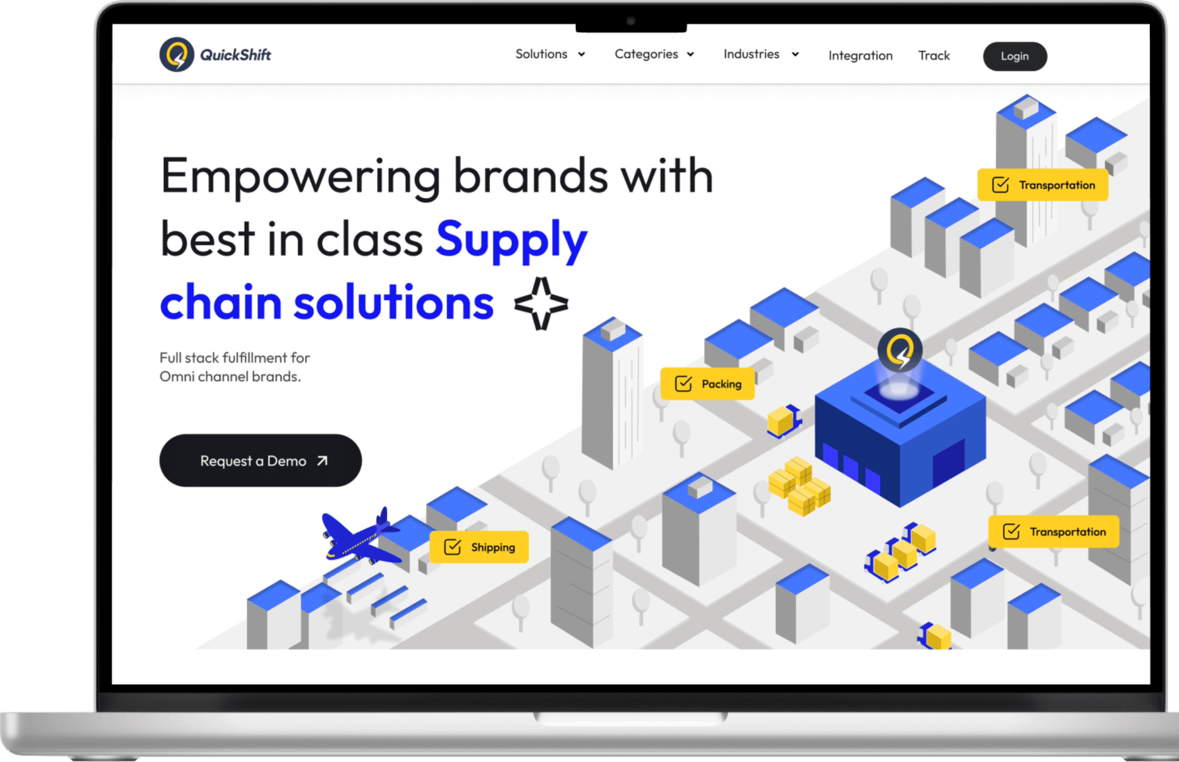
QuickShift’s commitment to delivering unparalleled supply chain management solutions posed a unique design challenge of creating a seamless and unified digital experience for their diverse clientele, including B2B, B2C, D2C, and omni-channel partners. Our design ensured that users, regardless of their technical expertise in any domain, could easily navigate the platform while grasping the sophistication of QuickShift’s offerings. At the core of each design decision was the intent to translate complex processes into a clear, accessible and visually engaging experience for all users.
Design
Crafting the reimagined look
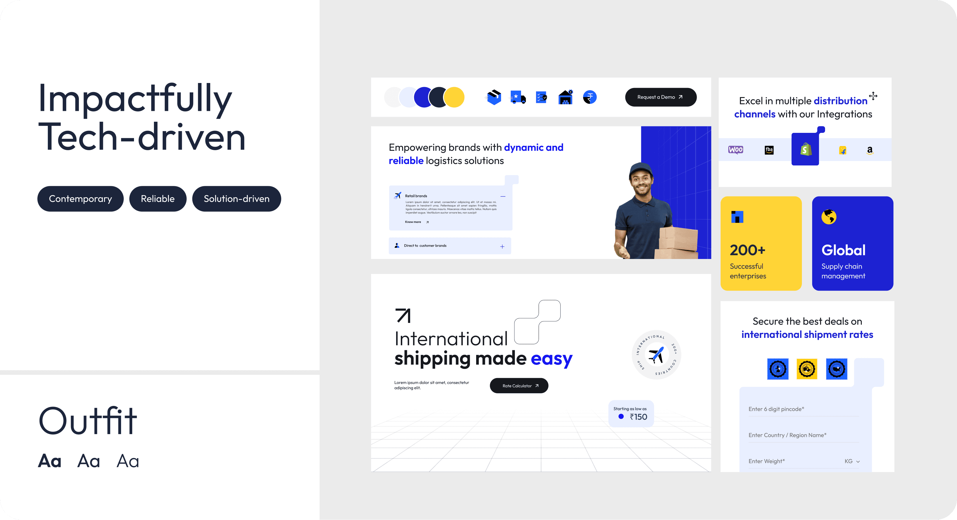
We prioritized visual storytelling, ensuring that each design element conveys a meaningful narrative. The choice of a modern, tech-forward typeface like Outfit symbolized the brand’s forward-thinking identity, while the meaningful color palette conveyed strength, reliability, and efficiency. The iconography was custom-built to reflect QuickShift’s tech-driven essence and convey a distinct sense of depth and innovation.
The digital city
We built a city-like architecture to represent QuickShift’s diverse supply chain verticals such as shipping, warehousing, and transportation. This approach allowed us to visualize their offerings through relatable, real-world scenarios, creating an intuitive narrative that resonated naturally with users. This cityscape not only showcased the business’s capabilities but also provided users with an engaging way to learn about them.

Polishing every pixel for maximum impact
Every element was meticulously crafted to create visual cues that bring personality and warmth to traditionally text-heavy sections. From custom-designed icons to subtle enhancements throughout forms and layouts, these intricate details transformed conventional elements into engaging and approachable components. Every pixel contributed to a cohesive, visually compelling user experience.
W
E
A
R
E
Q
U
I
C
K
S
H
I
F
T
•
W
E
A
R
E
Q
U
I
C
K
S
H
I
F
T
•
W
E
A
R
E
Q
U
I
C
K
S
H
I
F
T
•

H
e
a
t
h
r
o
w
A
i
r
p
o
r
t
U
n
i
t
e
d
K
i
n
g
d
o
m
s

U
n
i
t
e
d
S
t
a
t
e
s
o
f
A
m
e
r
i
c
a
W
a
s
h
i
n
g
t
o
n
N
a
t
i
o
n
a
l
A
i
r
p
o
r
t
How we solve for your problems at every step
Empowering the narrative with kinetic design
We leveraged motion to bring QuickShift’s services to life, using smooth transitions and dynamic feedback to guide users effortlessly through complex processes. These animations offered a sense of continuity and provided users with a delightful “aha” moment, making the experience memorable and impactful.
Final Visuals
QuickShift’s redefined brand identity positions the company as a leader in the supply chain industry. By portraying their best-in-class smart-tech solutions and services using creative storytelling, we crafted a digital presence that also exudes their reliability and professionalism.

About the company
Track your courier
Let’s turn your vision into human-centred experiences that speak to every user.
GET IN TOUCH

Currently at Purdue University | MS CGT UX design 2026